What drives an artist to see the world differently?
I’ve been fascinated by this question as I explore the intersection of art and science. And honestly? It’s pretty wild how artists don’t just create, they think in fundamentally different ways, blending intuition, observation, and imagination into something that transforms how we perceive reality.
The artistic mind operates through multiple cognitive stages simultaneously. It processes visual information, emotional responses, and cultural context all at once. This isn’t just creativity, it’s a sophisticated form of problem-solving that reveals profound insights about human perception. For those of us working with data, understanding this mindset opens up entirely new approaches to storytelling and communication. Trust me on this one. I’ve seen it work.
The Flow State: Where Magic Happens
So let’s get into how this works. Artists enter flow states that boost creativity by 600% and productivity by 500%. When you become really good at something, you can do it naturally without thinking too hard about it.
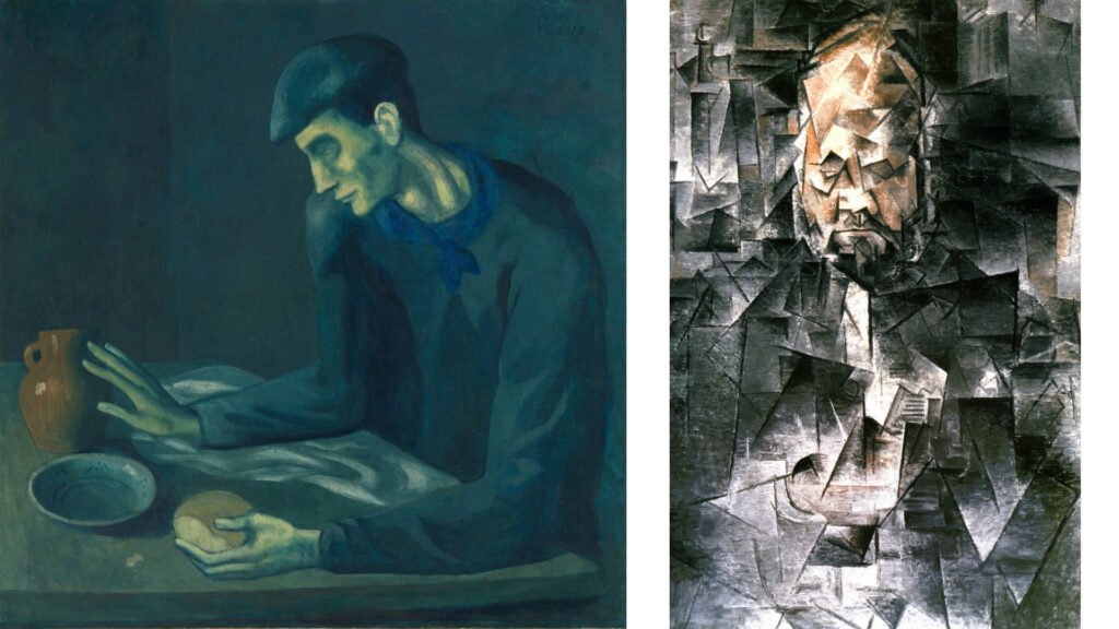
For example, take Picasso’s restless experimentation across styles. From his Blue Period melancholy to Cubist fragmentation, he didn’t plan these transitions knowingly. Instead, he trusted his artistic intuition to guide him through different visual languages, each emerging from deep engagement with the creative process.
Now here’s where we can relate, this same principle applies when we’re analyzing complex datasets. The boldest insights often surface when we stop forcing connections and let our trained pattern recognition take over. I’ve noticed my best data discoveries happen when I’m in that same flow state, expertise guiding intuition rather than overthinking every step. The struggle is real between wanting to control every variable and just letting the data speak to you.
Personal Vision: The Artist’s Unique Lens
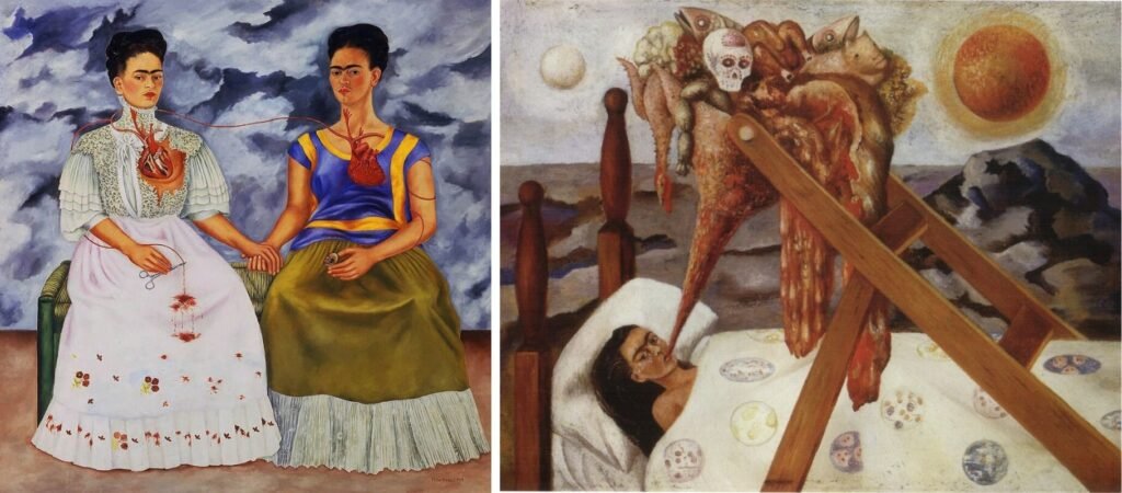
But flow state is just one form. Artists also draw from personal experiences and cultural influences to shape their distinctive vision. Frida Kahlo‘s symbolic self-portraits weren’t just paintings, they were visual translations of physical pain, emotional turmoil, and Mexican cultural identity into universal human experiences.
Every brushstroke carried meaning deep in her lived reality. The thorns, the bleeding hearts, the dual self-portraits, all emerged from her unique perspective on suffering, healing, and identity. She transformed deeply personal experiences into art that resonates across cultures and generations.
Similarly, data professionals can apply this same approach. Our personal experiences with different industries, challenges, and perspectives become the lens through which we interpret patterns. The stories we tell with data are most compelling when they’re filtered through our unique understanding of the human experience behind the numbers. This is exactly what I’ve been exploring in my work on Why Data Scientists Need to Think Like Artists, it’s all about bringing that artistic mindset into our data work.
The Artist’s Problem-Solving Process

Besides personal vision, though, artists are also constant decision-makers. Should this be oil or watercolor? Abstract or representational? Warm or cool palette? Each choice shapes the final emotional impact and meaning.
This decision-making process is methodical yet intuitive. Artists think about their medium’s properties, their subject’s emotional weight, and their audience’s likely response. They’re solving complex problems: How do I convey this feeling? How do I guide the viewer’s eye? How do I balance technical skill with emotional truth?
When you think about it, the parallels to data work are crazy. We make similar choices about visualization types, color schemes, and narrative structure. The difference is that artists have spent centuries perfecting techniques for human perception and emotional response, knowledge we can absolutely adapted for more effective data storytelling.
Thinking in Color and Form
Speaking of techniques, artists understand that color psychology operates at a neurological level. Your brain processes color before words, triggering immediate emotional responses that bypass conscious analysis.
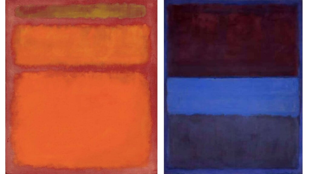
Take Rothko, for instance. He spent decades exploring how color combinations could evoke transcendent experiences. His massive color field paintings weren’t decorative, they were experiments in human consciousness. He discovered that certain color relationships could induce meditative states, while others created tension or joy.
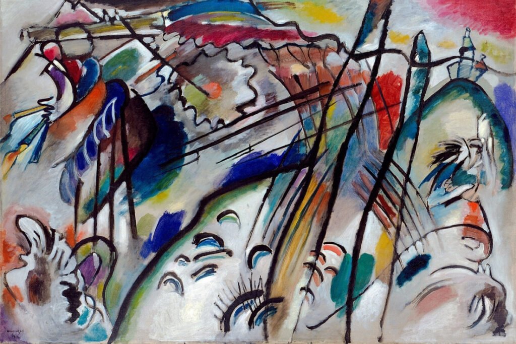
Meanwhile, Kandinsky went even further, mapping colors to specific emotions and sounds. Blue opened pathways to creativity and imagination. Yellow released energy and demanded attention. Red triggered vigilance and intensity.
Here’s the thing though, these aren’t just artistic preferences. They’re biological responses that data visualizations can leverage. When we understand how the artistic mind thinks about color as emotional language, we can craft data stories that resonate at a deeper level.
The Bridge to Visual Structure
Now, here’s where it can be applied. The artistic mind doesn’t just think about individual elements, it considers how those elements work together to create meaning. Color, form, and emotional content must be organized into coherent visual experiences that guide viewers through intended journeys.
This is where artistic thinking transitions from creative thoughts to visible designs. The artist’s mind naturally moves from “what do I want to express?” to “how do I arrange these elements to create that expression?”
And here’s why understanding this transition is crucial, because it reveals how artistic thinking can transform our approach to data presentation. Once we grasp how artists think about color and form, we can explore how they craft visual compositions that make complex ideas instantly simple.
At the end of the day, that’s where the real magic happens, when artistic thinking meets deliberate visual structure to create experiences that inform, inspire, and stick with audiences long after they’ve moved on. So here’s my challenge for you: Next time you’re working on a data visualization, ask yourself…what would Picasso do? What would Rothko choose? Try thinking like an artist for just one project. I think you’ll be surprised by what happens.
